Have you ever walked into a kitchen and instantly felt a sense of calm, or conversely, felt completely overwhelmed by its brightness? Why do some kitchens look effortlessly spacious and premium, while others feel cramped despite having the same square footage? Could the secret to a high-end, magazine-worthy culinary space lie entirely in your choice of colors?
When planning a home renovation, the best interior designers in Bangalore will tell you that the kitchen is no longer just a utilitarian zone hidden away from guests.
In modern, open-plan Indian homes, it is the social anchor of the household. As experienced interior designers in Bangalore, the Elevate Interio team understands that choosing the best kitchen color combinations is the most powerful, cost-effective way to achieve an affordable luxury look.
The right palette does more than just look pretty. It actively manipulates the perception of space, reflects natural light to make small layouts feel larger, and sets the emotional tone for your entire home. Whether you are balancing the rich, aromatic spices of Indian cooking or designing a sleek, minimalist coffee bar, your color choices must balance aesthetics with absolute daily practicality.
“True luxury isn’t about spending a fortune on materials. It’s about using color, light, and smart spatial planning to make a budget-friendly space feel entirely bespoke.”
– Elevate Interio Design Philosophy.
In this comprehensive guide, we will break down the absolute best color pairings for modern kitchens, blending international design trends with the practical realities of a busy Indian home. Let’s dive into the color combinations that will transform your kitchen into a stunning, functional masterpiece.
The Modern Classic is Warm Taupe and Crisp White
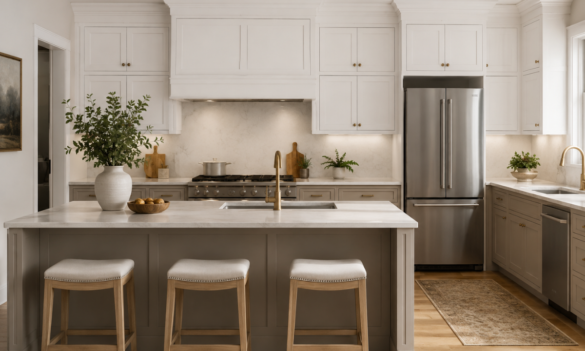
If you love the clean, bright look of a minimalist kitchen but worry that a pure, stark white will feel too clinical or worse, become a nightmare to clean after a week of traditional Indian cooking, this combination is your perfect answer.
The pairing of warm taupe and crisp white has emerged as one of the defining trends for an affordable luxury aesthetic.
By replacing harsh, bright whites with earthy, stone-inspired taupe tones, you instantly inject warmth and maturity into the room. This approach represents the latest kitchen colour combination Indian style, that balances a global, modern look with local lifestyle needs.
Visual Layout Guide:
- Upper Cabinets: Crisp White (Reflects light, opens up the room)
- Lower Cabinets: Warm Taupe (Grounds the space, hides everyday smudgese)
Why This Combination Works Beautifully
- The Spill-Proof Foundation: In an Indian household, the lower cabinets take the brunt of daily activity, oil splashes, and foot traffic. Applying a rich taupe or “mushroom” shade to the base modules keeps the kitchen looking pristine because it effortlessly masks minor smudges and dust.
- Visual Expansion: Keeping the overhead cabinets in a crisp, high-gloss white creates a brilliant optical trick. The white surfaces reflect natural light from your utility or balcony window, drawing the eye upward and making a compact 2BHK or 3BHK layout feel incredibly airy and expansive.
- The Perfect Countertop Match: This palette pairs beautifully with highly affordable yet premium-looking materials. A white quartz countertop with subtle grey veining or a classic grey granite ties the taupe and white elements together seamlessly.
Selecting Your Kitchen Wall Colour Combination
To prevent the space from looking flat, you must be intentional with your kitchen wall colour combination. If your cabinets are taupe and white, your walls should act as a soft backdrop rather than a competing element.
- The Safe & Sophisticated Choice: Paint the surrounding walls in a very soft cream or off-white. This maintains the bright, open feeling without introducing a third, conflicting tone.
- The Texture Play: Instead of flat paint, consider a backsplash featuring glossy white subway tiles with light grey grouting. The texture of the tile catches the light, adding a layered, expensive look to your walls without breaking your budget.
Elevate Pro-Tip: When using this palette, opt for matte or anti-fingerprint finishes on your taupe base cabinets, and high-gloss acrylic finishes on your upper white cabinets. This contrast in textures mimics the look of high-end European designer kitchens at a fraction of the cost.
By choosing this modern classic palette, you create a bright, inviting culinary workspace that feels timeless, requires minimal upkeep, and never goes out of style.
The Biophilic Retreat With Sage Green and Light Oak
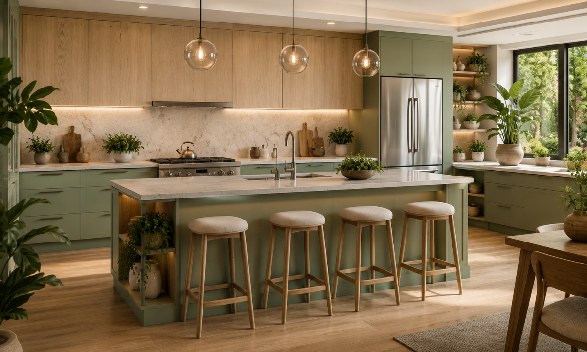
Are you looking to create a space that feels like a calming escape from the bustling city? The concept of biophilic design focuses on bringing elements of the natural world indoors.
For Bangalore apartments that may lack sweeping garden views, introducing organic colors into your kitchen is the smartest way to achieve this serene atmosphere.
The combination of muted sage green and light oak wood is dominating 2026 design trends. It moves away from artificial, glossy colors and embraces a grounded, earthy aesthetic.
Visual Layout Guide:
- Upper Cabinets: Light Oak Woodgrain (Brings warmth and natural texture)
- Lower Cabinets: Matte Sage Green (Provides a calming, grounded base)
Why This Combination Works Beautifully
- The Calming Effect: Sage green acts as a neutral rather than a bright accent color. It is incredibly soothing to the eye. When paired with the natural grain of light oak, the kitchen immediately feels like a premium, custom-built sanctuary.
- Textural Depth: Instead of relying entirely on flat painted surfaces, the woodgrain introduces organic movement. This mix of materials is a hallmark of high-end interior design, yet it remains incredibly budget-friendly when using high-quality laminates or engineered wood.
- Versatility in Lighting: Sage green adapts beautifully throughout the day. It looks fresh and vibrant in the morning sunlight and transforms into a cozy, intimate shade under warm evening LED lights.
Smart Execution With Perfecting the Details
To make this biophilic palette truly sing, you must pay attention to the finishing touches.
- Matte Over Gloss: Always choose a matte finish for your sage green cabinets. Glossy greens can look dated and artificial. A matte or “suede” finish absorbs light softly and looks infinitely more expensive.
- Hardware Selection: Brushed brass or antique gold handles are the ultimate companions for sage green. The warm metallic tones highlight the yellow undertones in the oak, creating a cohesive and luxurious finish.
- Countertop Pairings: Keep the countertop simple. A pure white quartz or a subtle beige composite stone allows the green and oak to remain the focal points without making the space look cluttered.
Elevate Pro Tip: To maximize your budget, allocate the light oak finish to open shelving or upper cabinets. This draws the eye upward and gives the illusion of taller ceilings, which is a brilliant strategy for compact urban homes.
This combination proves that you do not need harsh contrasts to make a statement. Soft, nature-inspired tones can completely elevate your daily cooking experience.
The Space-Maximizing Trick With Using The Two-Tone Tuxedo Kitchen (Navy & Cream)
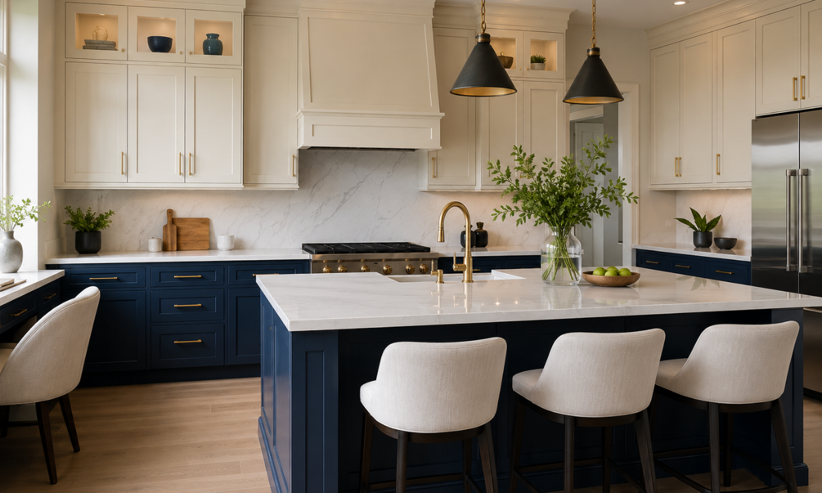
When dealing with a compact or narrow kitchen layout, a common mistake is painting everything white out of fear that dark colors will shrink the room.
However, monochromatic white spaces can sometimes feel flat and lose their character. If you want to introduce a rich, premium color like deep navy blue without making your space feel claustrophobic, the two-tone tuxedo kitchen layout is the ultimate design hack.
This approach is highly favored by interior designers because it relies on visual weight to trick the mind into perceiving more vertical space, making it an incredibly smart choice for modern urban apartments.
| Cabinet Level | Color Choice | Optical Effect |
|---|---|---|
| Upper Cabinets | Crisp Cream / Off-White | Reflects light, matches the ceiling, and visually expands the upper half of the room. |
| Lower Cabinets | Deep Navy Blue | Anchors the room, provides architectural contrast, and creates a sophisticated base. |
Why This Combination Works Beautifully
- The Illusion of Height: By keeping the upper cabinets in a light cream or off-white finish that closely matches your ceiling color, the boundary where the cabinets end and the ceiling begins becomes blurred. This draws the eyes upward and creates the illusion of a much taller room.
- A Solid, Functional Base: Deep navy blue on the lower cabinets adds a layer of undeniable luxury. From a practical standpoint, the Navy is incredibly forgiving when it comes to hiding watermarks, footprint smudges, and the inevitable stains that occur near the cooking zone.
- High Contrast on a Budget: This combination looks incredibly bespoke and expensive, yet it can be easily executed using standard, budget-friendly laminates or acrylic sheets. It delivers maximum visual impact without requiring costly custom paint jobs.
Perfecting the Kitchen Wall Colour Combination
To ensure your tuxedo kitchen feels balanced and cohesive, the surrounding walls and backsplash must play a supporting role.
- The Seamless Backsplash: Consider using a seamless cream quartz backsplash that extends directly from the countertop up to the base of the upper cabinets. This eliminates harsh visual break lines and keeps the workspace looking uncluttered.
- The Wall Palette: Keep your overall kitchen wall colour combination soft. A muted ivory, soft beige, or a very light grey on the remaining exposed walls will ensure the deep navy cabinets stand out as an intentional design feature rather than an overwhelming mass of color.
- Hardware and Accents: Navy blue and cream pair beautifully with chrome or silver hardware for a cool, contemporary look. If you prefer a warmer, classic feel, opt for brushed gold handles to add a touch of timeless sophistication.
Elevate Pro-Tip: When planning a tuxedo kitchen, ensure your ambient lighting is on point. Installing warm-white LED profile strip lights right under the upper cream cabinets will cast a beautiful glow directly onto the dark navy base, ensuring the workspace remains bright and highly functional at any hour of the day.
After carefully separating your light and dark tones, you can enjoy the drama of a deep, luxurious color palette while keeping your kitchen feeling spacious, open, and effortlessly modern.
Going Bold yet Grounded With Terracotta and Charcoal Grey
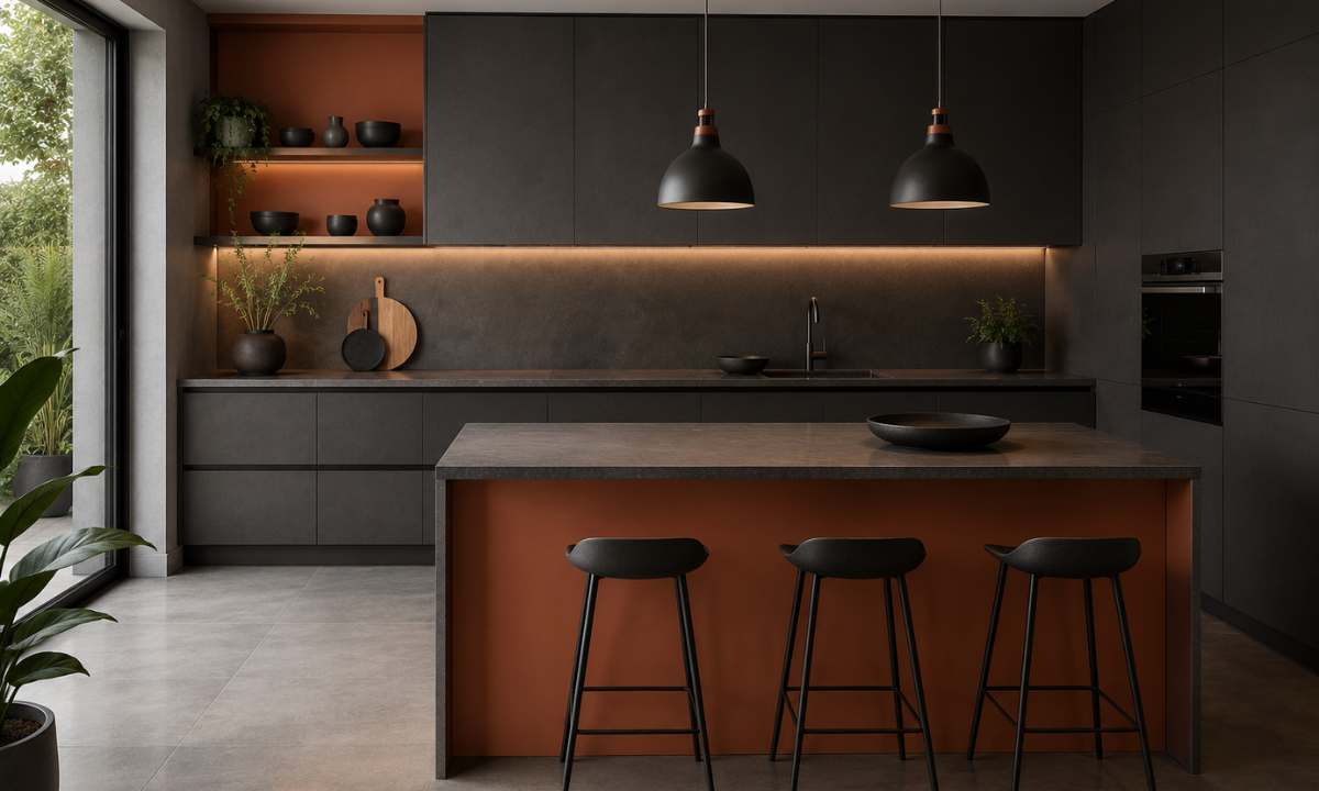
For homeowners who want their kitchen to be a striking conversation starter, pastel shades and bright whites might feel too safe.
If you are drawn to the rich, dramatic aesthetics of high-end European design but want to keep the execution practical and affordable, the pairing of terracotta and charcoal grey is the ultimate choice for 2026.
This combination perfectly captures the global shift away from cold, industrial greys toward warmer, earth-derived tones. It is bold, undeniably luxurious, and deeply grounded.
The Strategic Color Map:
- Primary Cabinetry (Base or Floor-to-Ceiling units): Charcoal Grey
- Accent Zones (Islands, Open Shelving, or Upper units): Baked Terracotta
Why This Combination Works Beautifully
- The Power of Contrast: Charcoal grey provides a sleek, modern foundation that feels more sophisticated than standard black. When you introduce terracotta, the deep grey makes the earthy orange-red tones pop beautifully, creating a dynamic visual tension that looks incredibly expensive.
- Warmth and Sociability: Terracotta is inherently a “warm” color. It mimics the look of natural clay and brick, instantly making a sleek, modern kitchen feel cozy, inviting, and ready for entertaining guests.
- Exceptional Durability: From a practical perspective, charcoal grey base cabinets are the ultimate shield against the heavy wear and tear of an active Indian kitchen. They effortlessly hide turmeric stains, water spots, and daily scuffs, making maintenance a breeze.
Smart Execution and Getting the Balance Right
When working with bold colors, the secret to maintaining an “affordable luxury” look lies in restraint and finish selection.
- Embrace the Matte Revolution: Glossy finishes can make deep colors look plasticky and cheap. You must specify a matte or “super-matte” finish for both the charcoal and the terracotta. This absorbs light softly, giving the laminates a rich, velvety appearance that mimics premium painted wood.
- Neutralizing the Walls: Because the cabinetry is doing all the heavy lifting visually, your kitchen wall colour combination needs to step back. Stick to a soft, warm beige or a muted off-white for the surrounding walls. Avoid pure, stark whites, as the contrast against the charcoal will be too jarring.
- Countertop and Hardware: To tie this look together, opt for a dark grey or concrete-finish quartz countertop. For hardware, matte black handles maintain a seamless, modern profile, while antique copper pulls will beautifully highlight the warmth of the terracotta.
Elevate Pro Tip: If you are nervous about committing to terracotta cabinets, use charcoal grey for all your modular units and introduce terracotta through your backsplash tiles. A textured terracotta subway tile set against sleek grey cabinets creates a stunning, custom-designed focal point without overwhelming the space.
This bold pairing proves that practical, budget-friendly materials can deliver breathtaking, magazine-ready results when the color strategy is executed flawlessly.
Why Choose Elevate Interio for Your Dream Kitchen?
When designing a modern kitchen in Bangalore, you shouldn’t have to choose between a premium aesthetic and a practical budget. Elevate Interio brings you the perfect sweet spot of affordable luxury, transforming your culinary space into a high-end zone with absolute peace of mind.
Here is what makes us the preferred choice for homeowners across Bangalore:
- 20% Extra Space Optimization: Our specialized design frameworks ensure we maximize every square inch of your kitchen layout, delivering clever storage solutions and seamless functionality.
- Guaranteed 45 to 60-Day Delivery: We value your time. Our robust in-house project management systems ensure your turnkey kitchen is completed and handed over strictly within our committed timeline.
- 10-Year Unmatched Warranty: We build for the long run. Every modular unit comes with a 10-year warranty alongside lifelong service support, ensuring your kitchen looks and performs flawlessly for a decade.
No hidden charges. No unexpected budget overruns. The detailed quotation you receive at the beginning of the journey is exactly what you pay at the end.
Conclusion
Your kitchen color combination is the foundation of your home’s daily energy and visual appeal. Whether you choose the timeless sophistication of warm taupe, the natural serenity of sage green, the smart spatial balance of a navy tuxedo layout, or the bold drama of earthy terracotta, the secret lies in pairing the right palette with impeccable execution.
Achieving a luxury look doesn’t require a boutique-firm price tag. It simply requires thoughtful design, durable materials, and a team that listens to your needs.
If you are ready to stop guessing and start visualizing your perfect kitchen, let our experts bring your ideas to life. Connect with Elevate Interio today for a personalized 3D design consultation, and let us craft a beautiful, space-optimized kitchen tailored around your lifestyle.