Have you ever walked into a room and instantly felt a wave of calm wash over you? Or conversely, have you ever felt inexplicably anxious in a beautifully furnished, yet harshly toned space? As leading Interior designers in Bangalore, we know that a home’s vibe is heavily dictated by its palette.
Transforming a modern apartment into a premium sanctuary isn’t just about buying expensive furniture; it is deeply rooted in color psychology in interior design. To achieve this flawless balance, partnering with a professional Interior design company in Bangalore ensures your space looks incredible and feels perfectly aligned with your lifestyle.
Every shade, tint, and hue you choose carries an invisible energy that actively alters human emotion, spatial perception, and daily behavior.
While it is tempting to simply pick your favorite colors from a catalog, a truly functional home requires a more strategic approach. In this comprehensive guide, we will explore how mastering this psychological language can elevate your daily routines, helping you design a residence that is not just visually stunning but also emotionally supportive.
Key Points at a Glance
- A clear definition of what color psychology means in the context of residential interior design.
- The profound impact color choices have on your daily mood and the perceived size of your rooms.
- How to utilize white color psychology to make a standard 3BHK feel expansive, airy, and luxurious.
- Practical strategies for balancing warm and cool tones to suit the Bangalore climate and lifestyle.
- A step-by-step guide to applying the professional 60-30-10 rule for a perfectly balanced color palette.
- How Elevate Interio translates psychological design theory into tangible, high-quality modular finishes.
What is Color Psychology in Interior Design?
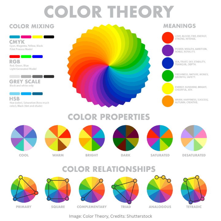
At its core, what is color psychology in interior design? It is the intersection of architectural science and human emotion. It is the study of how the hues we surround ourselves with influence our psychological state, physical well-being, and daily behavior.
As a leading Interior design company in Bangalore, we view color not merely as a decorative layer, but as an active participant in your mental health. By understanding how different wavelengths of light interact with the brain, we can curate environments that evoke specific, intentional reactions.
To truly grasp the depth of this field, it helps to look at the three primary pillars that professional designers use to evaluate a space:
- The Emotional Anchor: Every color carries a distinct psychological weight. For instance, blues are universally associated with the sky and ocean, which naturally helps in lowering heart rates and reducing anxiety.
- The Spatial Illusion: This is the “magic” of design. Darker tones absorb light and bring walls “inward” for a cozy, intimate feel, while lighter tones reflect light to push boundaries “outward,” making a standard apartment feel significantly larger.
- The Behavioral Trigger: Certain colors are functional. A specific shade of orange might stimulate appetite in a dining room, while a soft sage green might encourage deep focus in a home office.
When we approach a new project at Elevate Interio, we categorize the palette into two main psychological groups to help homeowners decide on their desired “vibe”:
- Active Colors:
- Warm Yellows and Oranges: These are high-energy hues that stimulate the senses.
- Vibrant Reds: Known to increase heart rate and encourage conversation.
- Best Use: These are perfect for social hubs like the living room or kitchen, where activity and engagement are the goals.
- Passive Colors:
- Cool Blues and Teals: These tones are essential for winding down the nervous system.
- Soft Greens: Evoke a sense of nature and renewal, reducing mental fatigue.
- Muted Purples: Often associated with luxury and creativity.
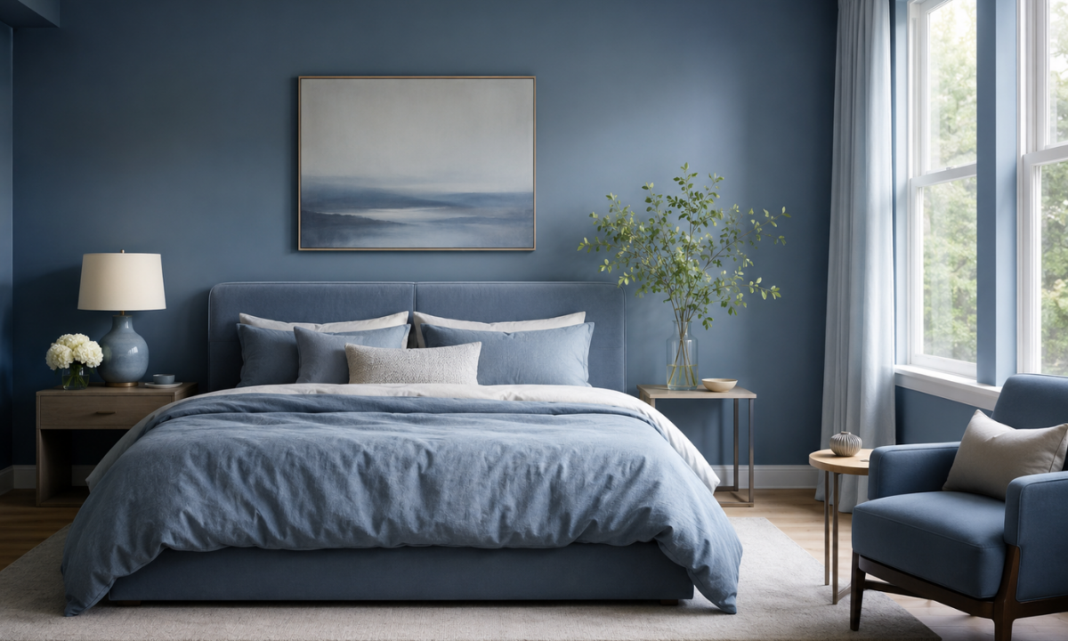
- Best Use: These are the primary choices for “rest zones” like bedrooms and reading nooks.
Mastering these nuances, we ensure that your home does not just look like a high-end showroom. Instead, it functions as a customized engine for your well-being, tailored specifically to how you want to feel the moment you step through the door.
The Importance Of Color Psychology In Interior Design
You might be wondering, amidst all the structural decisions involved in setting up a new apartment, why should palette selection take center stage?
The importance of color psychology in interior design cannot be overstated. It is the invisible force that dictates whether your 3BHK feels like a chaotic, cramped box or a sprawling, serene retreat. Color is the most cost-effective architectural tool at your disposal; it has the power to visually alter square footage and completely rewire your daily routines.
To truly understand this impact, let us look at the two most transformative ways color psychology functions in a modern Bangalore home:
1. The Architectural Cheat Code: Manipulating Space in urban apartments where square footage is finite, color acts as an optical illusion. You do not always need to knock down walls to make a room feel bigger.
- The Expansive Effect: Light, cool tones (like soft grays and icy blues) are “receding” colors. They reflect natural light and trick the eye into believing the walls are further away than they actually are.
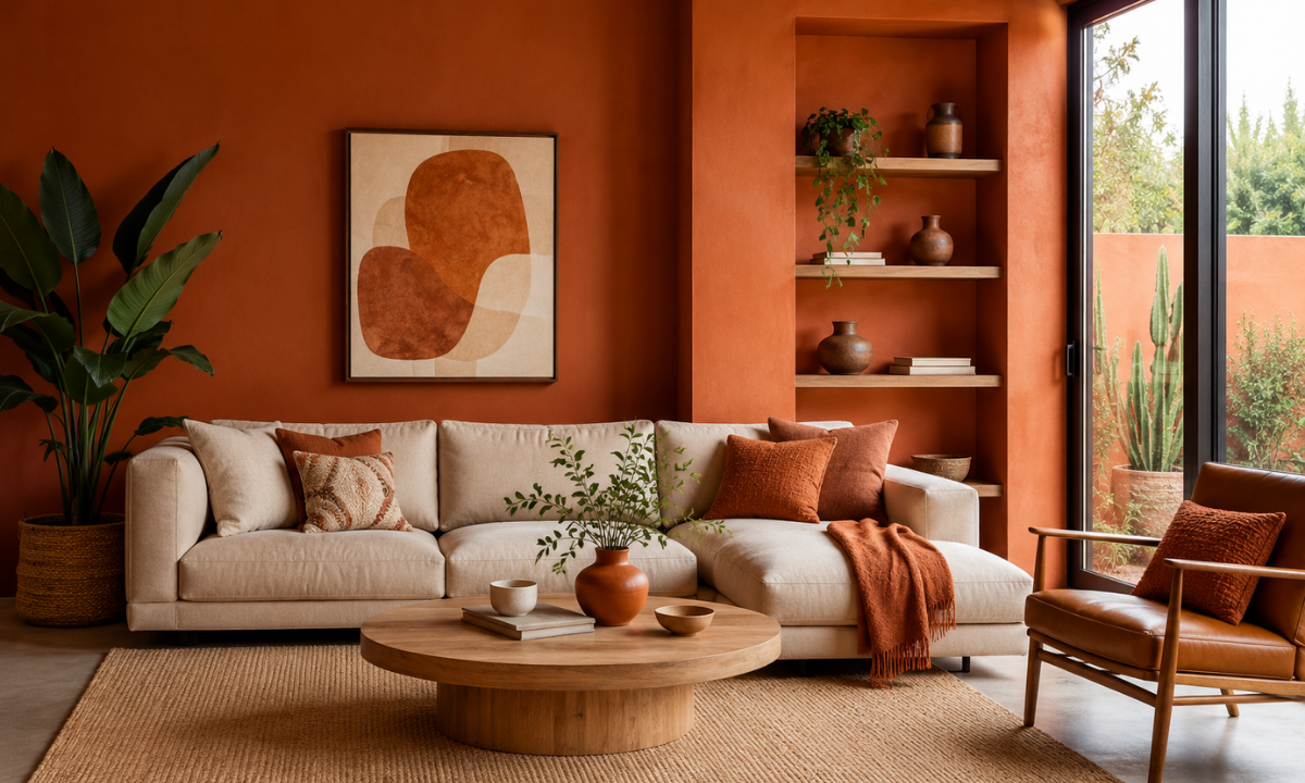
- The Intimate Effect: Conversely, dark, warm tones (like deep terracotta or charcoal) are “advancing” colors. They absorb light and pull the walls inward. While this might sound like a negative, using a dark hue strategically on a single accent wall can make a cavernous, empty-feeling media room feel instantly cozy and grounded.
2. Designing for the Clock: influencing daily routines your home should actively support the Different Phases of Your Day. The right color palette acts as a psychological cue, telling your brain when it is time to work, socialize, or rest.
- The Morning Rush (Kitchen & Dining): Warm, subtle undertones in your kitchen laminates like a soft peach or creamy beige can gently stimulate energy and optimism, making the morning rush of packing lunches and brewing coffee feel less stressful.
- The Deep Work Zone (Home Office): If your workspace is painted in stark, pure white, it can feel clinical and induce eye strain. Introducing muted sage greens or slate blues drops the visual “noise” of the room, naturally enhancing focus and reducing Zoom-fatigue.
- The Wind-Down (Master Bedroom): This space requires passive, restorative colors. Transitioning from the bright, active energy of your living room into a bedroom enveloped in soft lavender, dusty rose, or deep navy signals to your nervous system that the day is over, directly promoting better sleep hygiene.
Understanding the profound importance of these choices is what separates a standard renovation from a high-end, lifestyle-centric design. It ensures your home works with you, naturally elevating your mood from the moment you wake up.
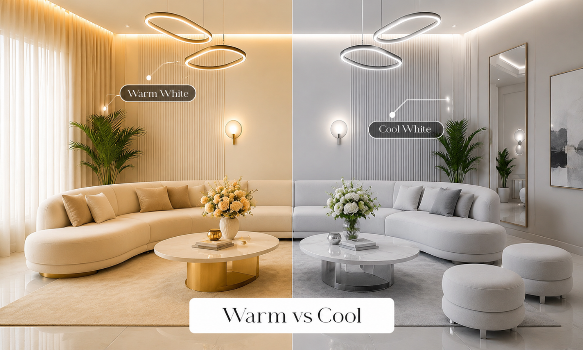
White Color Psychology In Interior Design
When homeowners first consider a neutral palette, a common fear often arises. Many worry that painting their walls white will make the apartment feel like a sterile hospital ward.
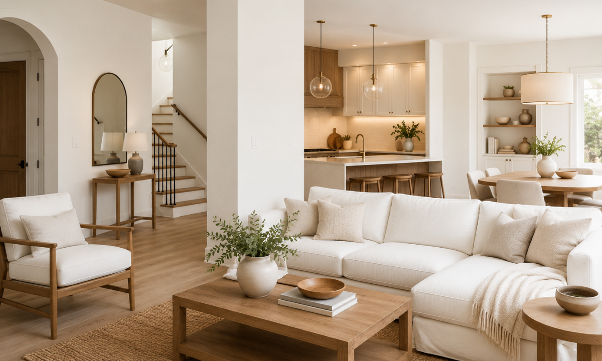
However, mastering white color psychology in interior design is the ultimate secret to achieving a coveted, high-end look. In the context of modern Bangalore apartments, white is not an absence of colour; it is a highly strategic design choice that serves as the master of spatial perception.
Pure, stark white can indeed feel clinical, which is why professional designers rarely use an untinted white for residential walls. Instead, we favour layered, nuanced tones such as creamy off-whites, soft ivories, and warm alabaster. These specific shades possess a unique psychological advantage.
First, they act as the ultimate light reflectors. By bouncing natural sunlight across the room, these warm whites trick the human eye into perceiving the room’s boundaries as much farther away. This instantly makes a standard living space feel significantly more expansive and airy.
Secondly, white provides vital psychological breathing room. In a fast-paced city environment, our minds are constantly bombarded with visual noise and stimuli. Returning to a home anchored in soft white tones creates an immediate sense of tranquillity, cleanliness, and order. It allows your nervous system to decompress naturally.
To prevent these bright spaces from feeling cold or uninviting, the secret lies in textural balance. Here is how professional designers bring a white room to life without compromising its serene energy:
- Introducing Natural Timber: We intentionally contrast soft white wall finishes with warm, wood-grain laminates for wardrobes or modular TV units, instantly grounding the room.
- Layering Tactile Fabrics: Incorporating plush rugs, linen curtains, and heavily woven cushions adds essential visual weight and physical comfort.
- Deploying Ambient Lighting: Using warm LED cove lighting ensures the white walls glow beautifully during the evening, completely avoiding any harsh or fluorescent glare.
This strategic color combination is the true hallmark of the accessible premium aesthetic. It guarantees your home feels pristine, sophisticated, and remarkably cozy all at once.
Warm vs. Cool Tones: and Designing for the Bangalore Climate
When we discuss color psychology in interior design, understanding a hue’s temperature is just as important as the hue itself. Bangalore enjoys a relatively moderate climate throughout the year, but the abundant natural sunlight can drastically alter how an apartment feels depending on the direction your windows face.
As professional designers, we do not just pick colors because they look beautiful. We actively use color temperature to balance the physical climate of your home.
We categorize palettes into two primary temperature families: warm tones and cool tones. Knowing how to deploy these groups strategically ensures your home remains comfortable and visually balanced regardless of the season outside.
The table below breaks down how we apply this climate-conscious strategy to modern apartments:
| Color Temperature | Typical Hues | Psychological and Visual Effect | Ideal Bangalore Room Application |
|---|---|---|---|
| Warm Tones | Terracotta, Mustard Yellow, Rust, Creamy Beige, Warm Oak | Creates a cozy, inviting, and stimulating environment. These colors absorb shadows and make large, empty spaces feel more intimate and grounded. | North-Facing Rooms: These spaces receive softer, indirect light and can sometimes feel flat or cold. Warm tones inject necessary energy and brightness. Excellent for living rooms and social hubs. |
| Cool Tones | Sage Green, Slate Blue, Crisp Gray, Soft Teal, Mint | Evokes a refreshing, calming, and expansive atmosphere. These colors visually recede, making walls feel further away and lowering the perceived temperature of the room. | South or West-Facing Rooms: These spaces often receive intense, direct afternoon sunlight. Cool tones neutralize the harsh heat, creating a tranquil oasis. Perfect for master bedrooms and home offices. |
To put this into perspective, imagine your 3BHK has a large south-facing balcony. The late afternoon sun will flood that connected living space with intense heat and golden light.
If you were to paint those walls in deep reds or bright oranges, the room would visually compound the heat and feel stifling. Instead, applying a cool slate blue accent wall or using soft mint upholstery will visually neutralize the warmth. It creates a refreshing and highly balanced sanctuary.
Conversely, a north-facing guest bedroom might not receive any direct sunlight throughout the day. If you use a stark, cool gray in this room, it can end up feeling dreary and unwelcoming. By introducing warm wooden laminates, beige textiles, and perhaps a subtle mustard accent, you instantly compensate for the lack of sun. You bring a permanent, artificial warmth into the space.
Matching your color psychology strategy with the natural architectural light of your Bangalore apartment is the ultimate mark of a professionally designed home.
The 60-30-10 Rule and Balancing Your Palette Like a Pro
Even with a perfect understanding of color psychology in interior design, a room can quickly feel chaotic or uninspiring if the proportions are incorrect. To achieve that polished, professionally designed look often seen in high-end showrooms, we follow a timeless mathematical formula known as the 60-30-10 rule.
This simple guideline ensures that your chosen palette is distributed in a way that feels balanced, intentional, and harmonious to the human eye.
The rule breaks down the distribution of colour into three distinct layers:
- 60% Primary Colour: This is the dominant hue that sets the overall mood of the room. It typically covers the largest surface areas, such as your walls, large area rugs, or perhaps a sprawling sofa. In many premium Bangalore apartments, this is often a soft neutral or a warm off-white.
- 30% Secondary Colour: This shade supports the primary colour but is different enough to create visual interest. It usually appears in your upholstery, curtains, or large modular units like wardrobes and kitchen cabinetry. It provides the necessary depth to keep the room from looking flat.
- 10% Accent Colour: This is your “pop” of personality. It is used sparingly in decorative items such as cushions, artwork, lighting fixtures, or even a small accent chair. Because it only accounts for a small fraction of the room, you can afford to be bold and experimental with this choice.
Applying this rule to a standard 3BHK living room in Bangalore might look like this:
- The 60%: Warm Alabaster walls and a light oak-textured laminate for the main flooring. This creates a serene, expansive backdrop that reflects natural light.
- The 30%: A deep Navy Blue for the sectional sofa and matching floor-to-ceiling sheer curtains. This introduces a “passive” psychological energy that promotes relaxation and groundedness.
- The 10%: Brushed Gold light fixtures and vibrant Terracotta cushions. These warm accents prevent the blue and white from feeling too cold, adding a layer of sophisticated energy.
When we design for our clients, we also apply this logic to the functional zones of the home, particularly in modular kitchens:
- Cabinetry (60%): A light grey or matte white finish for the main overhead and base cabinets to maintain a sense of cleanliness.
- Countertop and Backsplash (30%): A dark quartz or textured tile that provides a sturdy, sophisticated contrast.
- Hardware and Accessories (10%): Black matte handles, a designer faucet, or small countertop appliances that tie the entire look together.
You ensure that no single colour overwhelms the space or causes visual fatigue. Instead, the room feels like a cohesive story where every element has its place, allowing the psychological benefits of your chosen colours to truly shine.
Why Choose Elevate Interio for Your Home Transformation
Selecting the perfect palette is only half the battle. The true challenge lies in executing that vision with technical precision and high-quality finishes. As a leading Interior design company in Bangalore, Elevate Interio specialises in turning abstract psychological theories into tangible, premium realities.
When you partner with the most trusted Interior designers in Bangalore, you gain access to a streamlined experience that removes the guesswork from the design process:
- Photorealistic 3D Visualisations: We provide high-definition renders that allow you to see exactly how your chosen colours interact with natural light before any work begins on-site.
- The 45-Day Delivery Guarantee: Our advanced modular manufacturing ensures that your home is fully fitted and ready for move-in within 45 days of design finalisation.
- A 10-Year Comprehensive Warranty: We use only premium materials, including termite-resistant engineered wood and high-grade acrylics, ensuring your colours remain vibrant and your cabinets stay durable for a decade.
- Transparent and Fixed Pricing: We believe in absolute honesty. Our quotes are detailed and final, meaning you will never encounter hidden costs or sudden price escalations during the project.
- The Indiranagar Experience Centre: We invite you to visit our studio to touch and feel the actual materials, allowing you to witness the quality of our finishes in person.
We understand that your home is a significant investment, and our process is designed to ensure that every colour and texture works in harmony with your lifestyle.
Conclusion
Mastering color psychology in interior design is about much more than just aesthetics. It is a strategic tool that allows you to craft a sanctuary that reflects your personality and actively supports your mental well-being. Whether you are leveraging the expansive power of white or using the 60-30-10 rule to balance a bold living room, every decision you make should serve a purpose.
At Elevate Interio, we are committed to helping you navigate these choices with ease. By combining scientific design principles with expert craftsmanship, we transform standard apartments into high-end, lifestyle-centric homes.
Ready to bring your vision to life? Visit our Indiranagar experience centre today to speak with our experts and see how the right palette can completely redefine your living experience.
Frequently Asked Questions (FAQs)
1. What is color psychology in interior design, and why does it matter?
Color psychology in interior design is the study of how different hues and shades affect human emotions, spatial perception, and daily behaviour. It matters because the colours you choose dictate the energy of a room. For example, active warm tones stimulate conversation in a living room, while passive cool tones promote relaxation in a bedroom.
2. How can I use white color psychology in interior design without making my home look clinical?
The secret to using white effectively is avoiding stark, hospital-like shades and instead opting for warm off-whites, creamy ivories, or soft alabaster. Professional interior designers in Bangalore prevent these spaces from feeling cold by layering tactile textures, introducing natural wood-grain laminates, and using warm ambient lighting to create a cosy, expansive atmosphere.
3. Why should I hire an interior design company in Bangalore just to pick colours?
While choosing a paint colour might seem simple, a professional interior design company in Bangalore does much more than just select shades. We calculate how natural sunlight in your specific apartment interacts with different hues, apply mathematical frameworks like the 60-30-10 rule for perfect visual balance, and translate those colour choices into high-quality modular finishes like premium acrylics and textured laminates.