
“Why does my home still not feel right even after buying beautiful furniture?”
If you have ever asked yourself this, the answer often lies in choosing the perfect color combination for the home interior.
Colours don’t just decorate a space; they influence your mood, productivity, and even how spacious your home feels. That’s exactly why many homeowners today turn to the best interior designers in Bangalore to curate palettes that balance beauty with functionality. From subtle neutral to bold statement hues, the right combination can redefine your entire living experience, so which ones truly work best for your home?
Key Points at a Glance
- Colours directly impact emotions, comfort, and visual space perception
- The right palette enhances both aesthetics and functionality
- Balanced room color combinations create harmony and flow
- Strategic use of warm color combinations adds energy and depth
- Natural tones like green and brown bring calmness and balance
- Expert guidance helps avoid costly design mistakes
List Of Top 10 Color Combinations for Home Interior
1. Classic White and Beige – Timeless Elegance
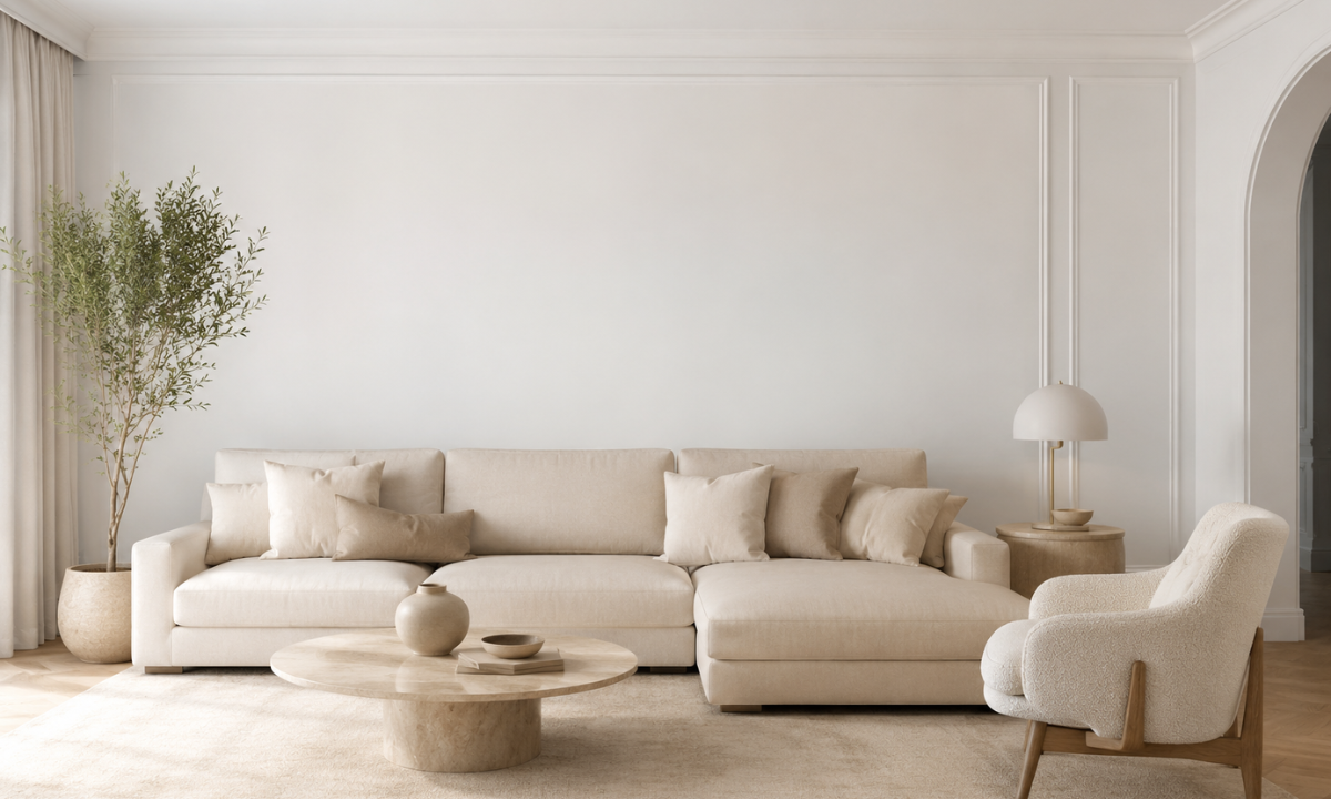
White and beige create a soft, neutral palette that never goes out of style. This combination reflects light beautifully, making even compact homes feel airy and open.
It is one of the most preferred living room color schemes because it pairs effortlessly with wooden furniture, metallic accents, and textured fabrics. The subtle warmth of beige prevents the space from feeling too sterile, while white keeps it fresh and clean.
- Ideal for minimalist and modern homes
- Works well with layered lighting and soft furnishings
- Creates a calm and welcoming environment
2. Grey and Yellow – Contemporary Energy
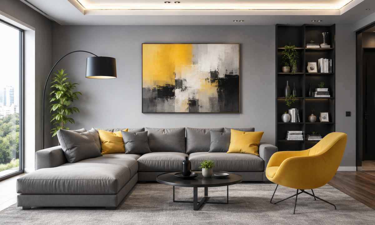
Grey provides a sophisticated base, while yellow injects vibrancy and positivity into the space. This combination is perfect for homeowners who want a modern yet lively interior.
Using yellow as an accent, through cushions, artwork, or a feature wall, can instantly uplift the mood without overwhelming the space. Meanwhile, grey tones anchor the design, ensuring balance and elegance.
- Great for urban apartments and compact homes
- Enhances visual interest without clutter
- Works well with both matte and glossy finishes
3. Blue and White – Calm and Coastal
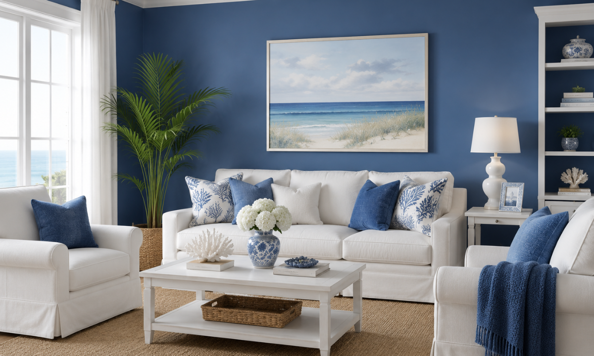
Blue and white together create a serene and refreshing environment that mimics coastal living. This palette is especially effective in spaces meant for relaxation, such as bedrooms and bathrooms.
Lighter shades of blue evoke calmness, while darker tones like navy add depth and character. White complements these shades by maintaining brightness and visual clarity.
- Promotes relaxation and reduces stress levels
- Enhances natural light in the room
- Suitable for both modern and traditional interiors
4. Green and Brown – Nature-Inspired Harmony
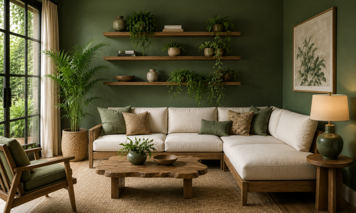
A green color combination for house interior paired with earthy brown tones creates a grounded and peaceful ambience. This palette brings the calming essence of nature indoors.
Green symbolises growth and freshness, while brown adds stability and warmth. Together, they create a balanced environment that feels both rejuvenating and comforting.
- Ideal for eco-friendly and biophilic designs
- Works beautifully with indoor plants and wooden textures
- Perfect for living rooms, study areas, and balconies
5. Black and White – Bold and Minimal
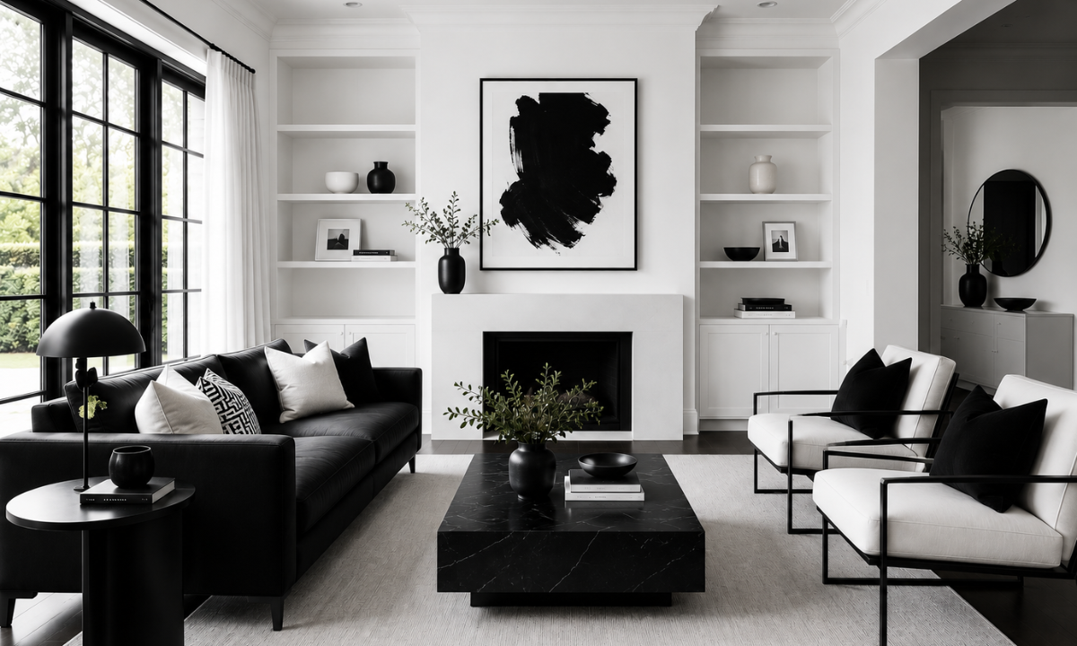
Black and white is a timeless pairing that delivers a strong visual impact. It is ideal for homeowners who appreciate clean lines and modern aesthetics.
The contrast between these two shades creates depth and drama, making the space feel structured and intentional. Adding textures like marble or matte finishes can further enhance this look.
- Perfect for contemporary and luxury interiors
- Easy to accessorise with metallic accents
- Creates a striking yet balanced environment
6. Pastel Pink and Grey – Soft and Elegant
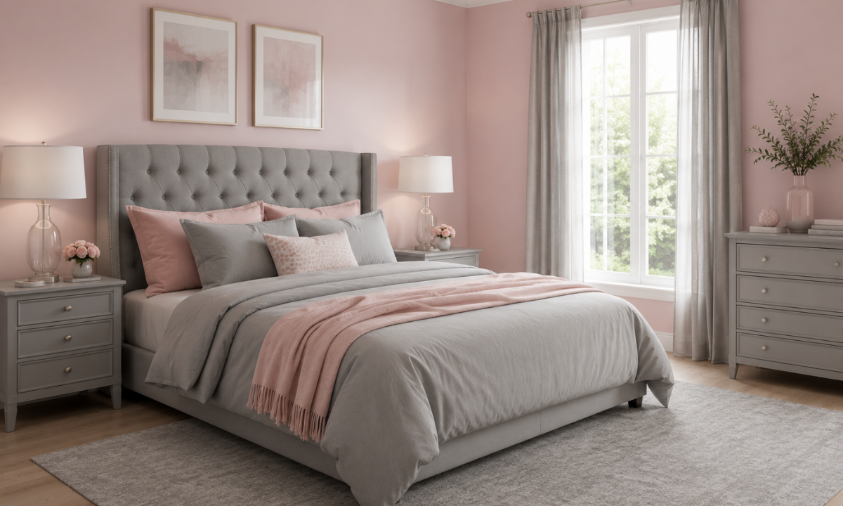
Pastel pink combined with grey offers a delicate balance of warmth and neutrality. This combination is increasingly popular in modern homes for its understated charm.
The softness of pastel tones makes the space feel inviting, while grey ensures it remains sophisticated and not overly feminine. This pairing works particularly well in bedrooms and cosy corners.
- Enhances comfort and visual warmth
- Suitable for both adults’ and children’s spaces
- Adds a subtle touch of personality
7. Terracotta and Cream – Earthy Warmth
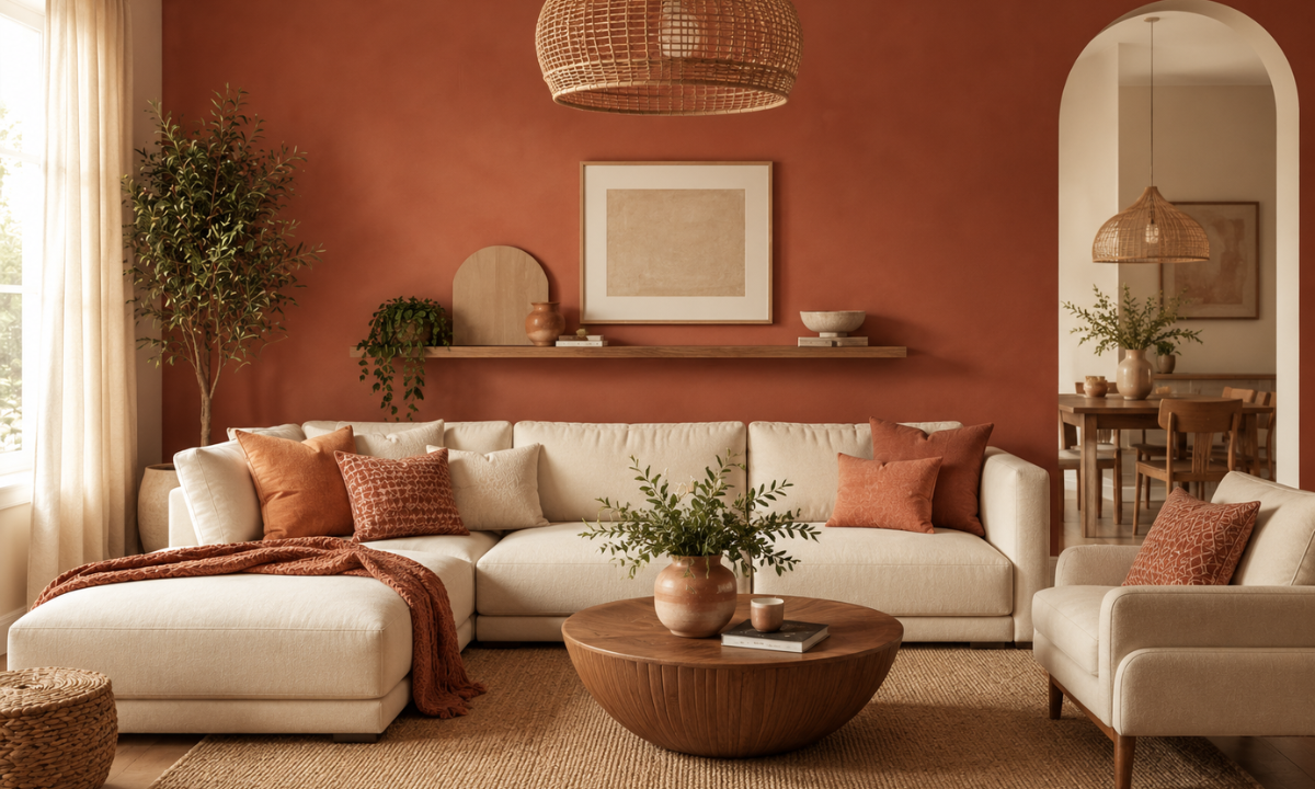
Terracotta paired with cream creates one of the most inviting warm color combinations. It adds richness and a sense of tradition while still feeling contemporary.
Terracotta tones bring depth and character, while cream balances the intensity with softness. This combination is especially suited for Indian homes where warmth and hospitality are key.
- Works well with natural materials like wood and stone
- Ideal for dining and living areas
- Creates a cosy and welcoming ambience
8. Navy Blue and Gold – Luxury Statement
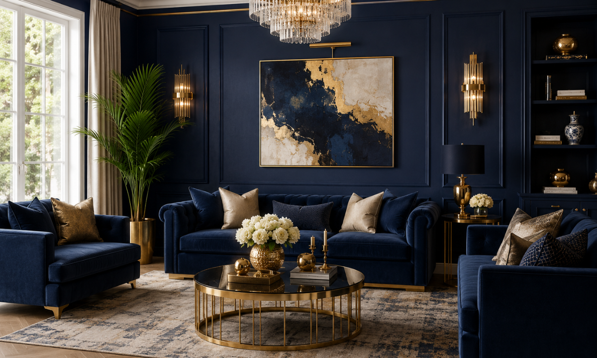
Navy blue and gold together create a luxurious and sophisticated interior. This combination is perfect for those who want to make a bold style statement.
While navy blue adds depth and elegance, gold accents introduce a touch of glamour and refinement. The key is to use gold sparingly to maintain balance.
- Ideal for feature walls and statement décor
- Enhances the richness of the space
- Works well with velvet and textured fabrics
9. Olive Green and White – Subtle Sophistication
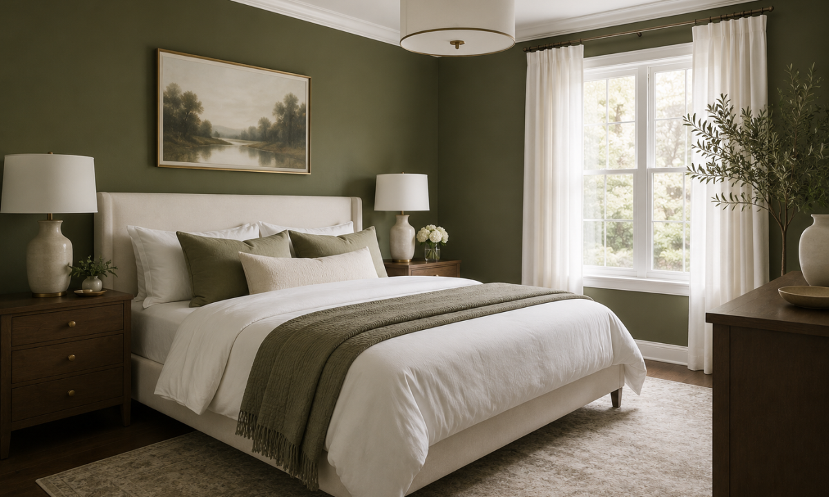
Olive green is a muted, earthy tone that pairs beautifully with crisp white. This combination creates a calm and refined environment without being overpowering.
It is perfect for homeowners who want a modern yet natural look. The neutrality of olive green allows it to blend seamlessly with various décor styles.
- Adds depth without overwhelming the space
- Works well in bedrooms and reading areas
- Complements wooden and neutral furniture
10. Orange and Grey – Vibrant Contrast
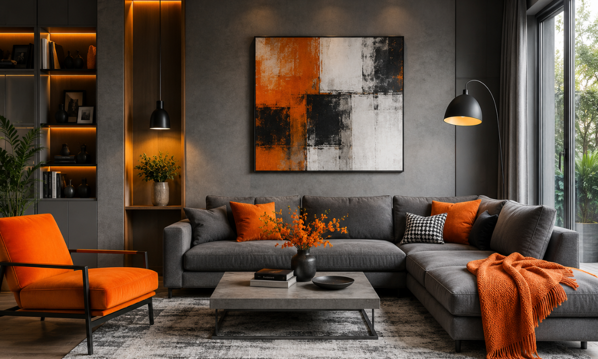
This combination create a bold yet balanced palette that energises the space. Orange brings warmth and enthusiasm, while grey keeps it grounded.
This combination is especially effective in creative spaces or areas where you want to encourage activity and interaction. When used correctly, it adds personality without chaos.
- Ideal for living rooms and home offices
- Creates a lively and engaging atmosphere
- Works well with modern furniture styles
How to Choose the Right Room Color Combinations
Selecting the right colours involves more than just personal preference. It requires understanding how different elements interact within a space.
| Factor | What to Consider |
|---|---|
| Room Size | Light shades open up small spaces, while dark tones add cosiness to larger rooms |
| Lighting | Natural light enhances cool tones, while artificial lighting warms up colours |
| Purpose | Choose calming shades for bedrooms and energising tones for social areas |
| Furniture | Ensure colours complement existing materials and finishes |
| Mood | Decide whether you want a relaxing, vibrant, or luxurious feel |
Tips from Interior Experts
Experienced interior designers in Bangalore suggest focusing on balance and proportion when selecting colours. A well-planned palette can completely transform the usability and aesthetics of your home.
- Follow the 60-30-10 rule for balanced colour distribution
- Use textures and finishes to add depth to flat colours
- Always test paint samples under different lighting conditions
- Incorporate accent colours through décor rather than walls
- Maintain consistency across rooms for a cohesive look
Common Mistakes to Avoid
Even the best colour combinations can fail if not executed properly. Avoiding common mistakes can save both time and money.
- Ignoring lighting conditions while selecting shades
- Overusing bold or dark colours in small spaces
- Mixing too many colours without a clear theme
- Skipping sample testing before the final application
Final Thoughts
Choosing the right color combination for home interior is about more than just visual appeal; it’s about creating a space that supports your lifestyle, mood, and daily experiences. The right colours can make your home feel larger, brighter, and more inviting while reflecting your personal style.
If you want expert guidance, consulting the best interior designers in Bangalore can help you achieve a perfectly balanced and timeless design. At Elevate Interio, every space is crafted with precision, creativity, and a deep understanding of how colours influence living.
FAQs
1. Which color combination is best for small homes?
Light and airy shades such as white, beige, soft greys, and pastels work best for small homes because they reflect more light and make spaces feel open and spacious. Pairing these with subtle contrasts, like light wood or muted accents, can add depth without making the room feel crowded or visually heavy.
2. Are warm colors suitable for all rooms?
Warm colors like red, orange, and yellow are energising and inviting, making them ideal for living rooms and dining areas where interaction happens. However, they may feel overwhelming in bedrooms or relaxation zones, where cooler tones like blue or green are better suited to create a calm, restful environment.
3. How many colors should I use in one room?
It’s best to stick to two or three primary colors in one room to maintain a balanced and cohesive look. A common approach is the 60-30-10 rule, where one dominant color is supported by a secondary shade and a smaller accent, ensuring visual harmony without overwhelming the space.
4. What is the most trending color combination today?
Currently, neutral bases such as grey, beige, and off-white paired with bold accents like mustard yellow, navy blue, or emerald green are highly trending. This approach allows homeowners to keep their interiors timeless while adding personality through accents, making it easy to refresh the space without major redesign efforts.