
Choosing paint swatches for your home can quickly feel overwhelming. With thousands of shades available, it is easy to get caught up in passing social media trends, only to realize a few years later that your walls feel dated or hard to maintain.
Focusing on classic interior colour combinations ensures your space stays warm, balanced, and visually inviting regardless of evolving decor styles. As the Best interior designers in Bangalore, Elevate Interio creates homes designed for living, where every shade is chosen not just for aesthetic appeal, but for how it responds to natural light, daily routines, and real-world family life.
A truly timeless palette does far more than cover raw plaster. It controls how spacious a room feels, sets the emotional energy of your living areas, and forms a flexible canvas that adapts whenever you swap out art or soft furnishings.
Applying simple design rules like the 60-30-10 ratio, where 60% of the room features a grounding dominant shade, 30% a secondary tone, and 10% an accent color you can curate an effortless balance that feels personal, comfortable, and enduring.
Earthy & Organic Classic Palettes
Idea 1: Warm Terracotta & Muted Beige
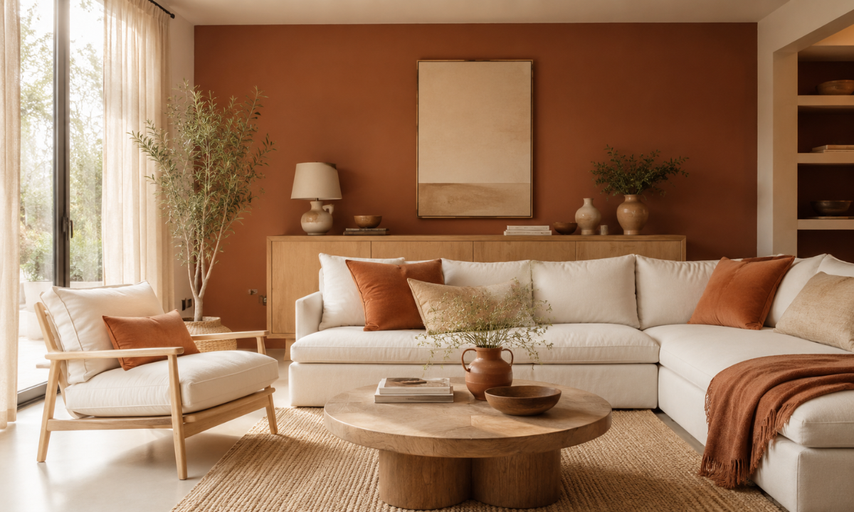
Terracotta brings a grounded, inviting energy into common living areas. Balancing deep clay tones with soft, sandy beige prevents the space from feeling heavy while keeping the overall room atmosphere warm and welcoming.
Pairing terracotta accent walls with light ash furniture or bleached oak joinery creates a natural, organic look. Soft linen drapery and off-white upholstery complete the scheme without competing for visual attention.
Matte paint sheens work particularly well for terracotta shades. They absorb harsh reflections and help soften bright afternoon light, making east and south-facing rooms feel comfortable throughout the day.
Idea 2: Sage Green & Soft Warm Cream
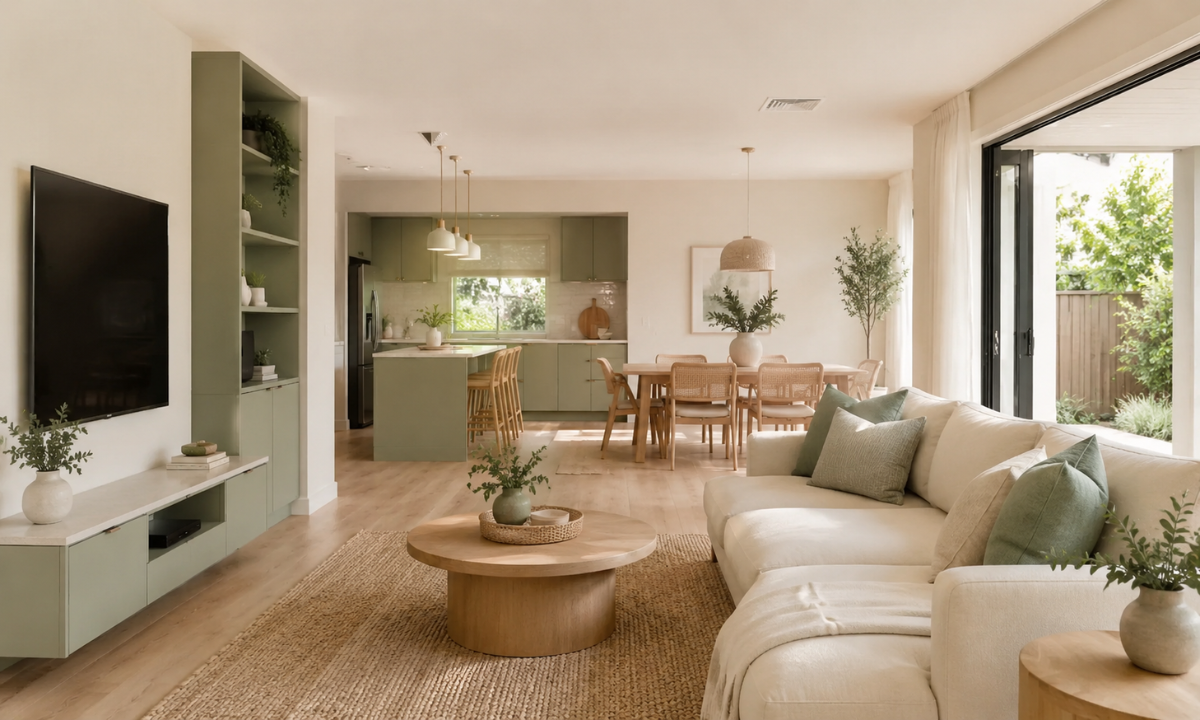
Sage green has earned its reputation as a permanent modern neutral. Choosing a thoughtful color combination of green paired with warm cream wall paint creates a tranquil backdrop that helps you unwind after a busy day.
This organic palette connects seamlessly with natural materials like woven cane furniture, jute rugs, and light quartz surfaces. It works exceptionally well in open-plan layouts, smoothly unifying living and dining areas.
Applying soft cream across the main walls while saving sage green for custom TV units or kitchen cabinetry keeps the space bright, open, and effortless to keep clean.
Idea 3: Warm Greige & Natural Wood Tones
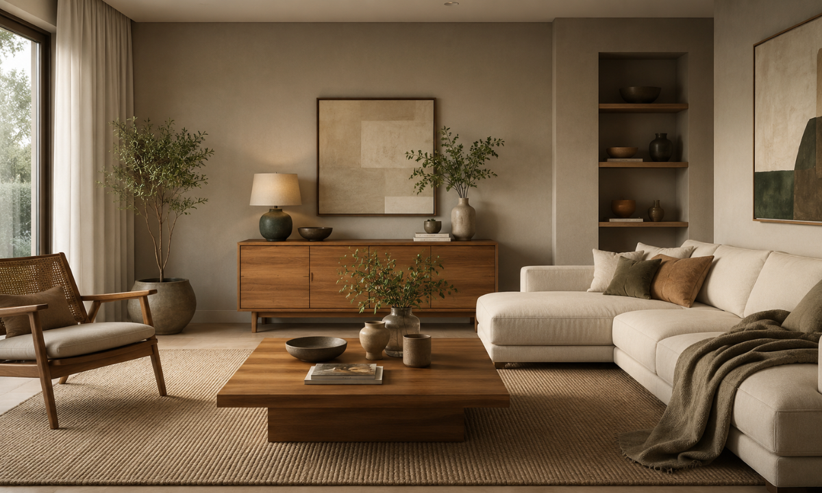
Greige successfully bridges the gap between cool grey and warm beige. It provides a versatile neutral foundation that shifts gracefully as natural sunlight transitions across your rooms from morning to evening.
Combining greige backdrop walls with warm teak or walnut wood furniture adds subtle depth. This classic pairing gives you complete freedom to refresh your soft furnishings whenever your personal style evolves.
Atmospheric & Deep Tones
Idea 4: Classic Navy & Crisp Warm White
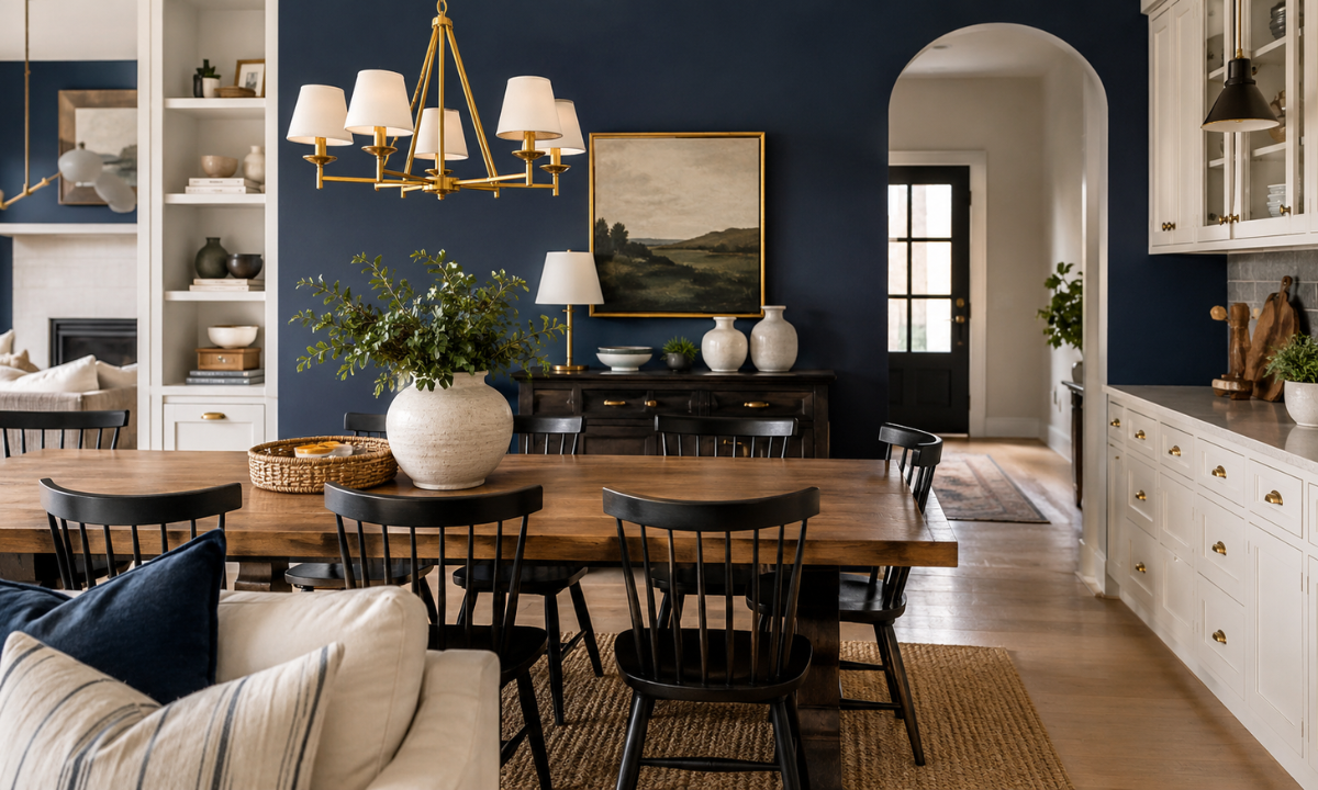
Deep blue brings a grounding, cozy intimacy to formal entertaining areas and home libraries. When exploring versatile colour combinations with blue, balancing a rich navy accent wall against crisp off-white cabinetry prevents the space from feeling enclosed or dark.
The contrast between ink-blue surfaces and light cream walls creates a clean, architectural backdrop. Incorporating warm wooden dining tables, natural jute accents, and satin brass drawer pulls adds soft warmth to the cool base tones.
Using navy paint in a washable, low-sheen satin finish protects high-contact areas against scuffs and fingerprints. This makes deep blue an exceptionally practical option for busy households with active children.
Idea 5: Charcoal Grey & Ochre Gold
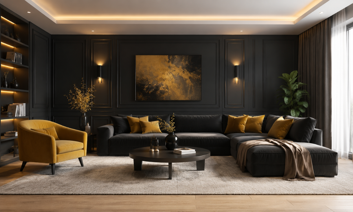
Charcoal grey creates a dramatic, modern foundation when evaluating versatile living room wall color combinations. Bringing rich ochre or mustard gold accents into the room through throw pillows and soft seating prevents dark charcoal walls from feeling cold.
Pairing charcoal wall paneling with light-reflecting ivory ceilings keeps the room feeling spacious. This color pairing pairs effortlessly with natural oak flooring, matte black fixtures, and subtle warm-white cove lighting.
Idea 6: Deep Teal & Dusty Rose
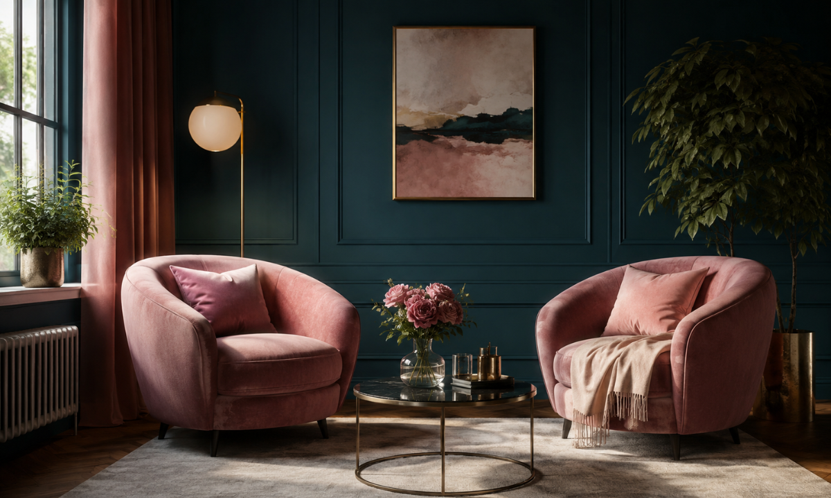
Deep teal balances the restorative qualities of green with the calm depth of blue. Pairing this jewel tone with soft, muted dusty rose creates an unexpected harmony that feels elevated without trying too hard.
Dusty rose upholstered lounge chairs soften the intense drama of dark teal backdrop walls. This vintage-inspired pairing introduces a quiet elegance to master suites, reading nooks, and formal sitting rooms.
For optimal light balance, save deep teal paint for walls that receive plenty of direct morning sunlight. Complementing the paint with warm 2700K LED lighting ensures the room stays inviting after sundown.
Selecting stain-resistant matte velvet or textured linen fabrics for soft furnishings maintains the tactile warmth of the palette, making daily maintenance straightforward for urban apartments.
Soft, Airy & Modern Classics
Idea 7: Soft Lavender & Warm Dove Grey
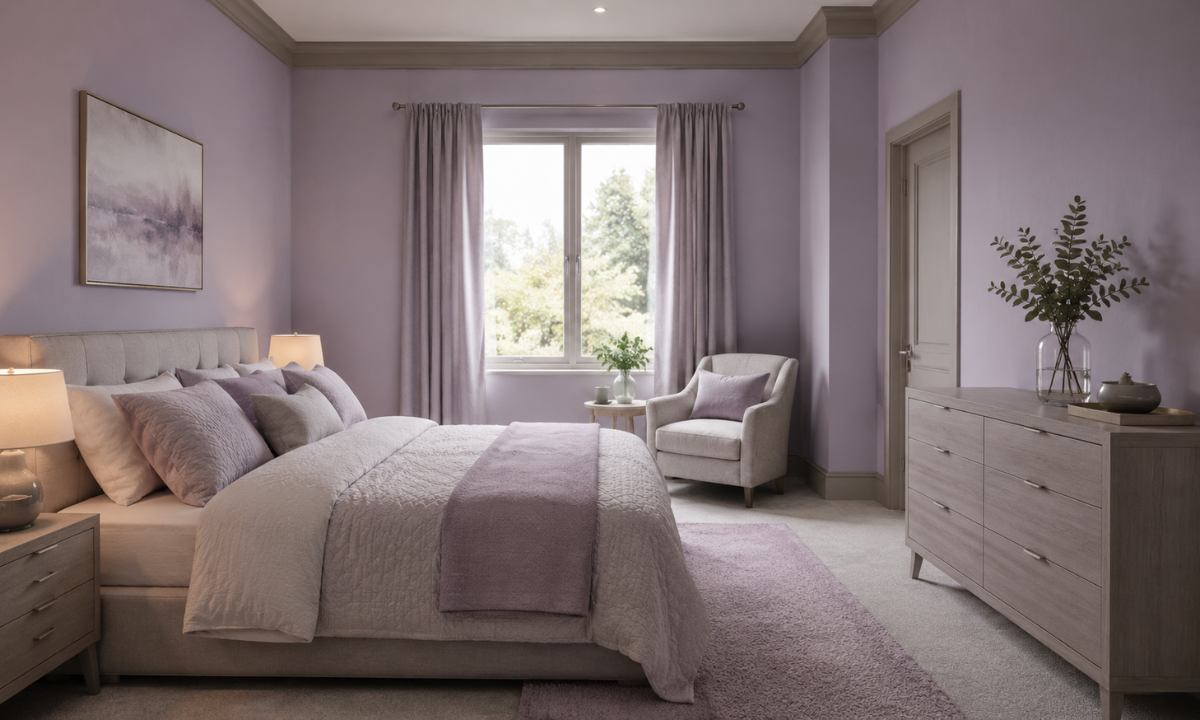
Soft lavender brings a calm, luminous quality to compact bedrooms and quiet reading corners. Balancing muted lavender backdrop walls with warm dove grey trim anchors the room, keeping the overall palette sophisticated and serene.
Introducing delicate pastel colours into your main living spaces works best when paired with matte finishes and light ash furniture. This combination softens bright afternoon light streaming through windows while maintaining clear visual depth across walls and joinery.
Idea 8: Olive Green & Natural Teak Wood
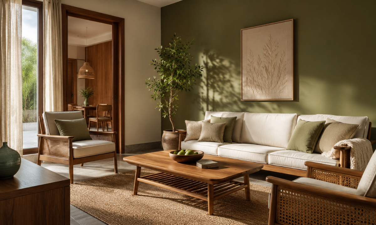
Olive green offers a rich, comforting depth that feels grounded and timeless in Indian homes. Pairing olive accent walls with natural teak wood joinery brings out the organic warmth of custom handcrafted furniture.
This muted green shade balances direct afternoon sunlight in west-facing rooms without feeling dark. Complementing the walls with off-white linen curtains and woven rattan details creates a relaxed environment built for everyday family living.
Idea 9: Warm Ochre & Crisp Ivory
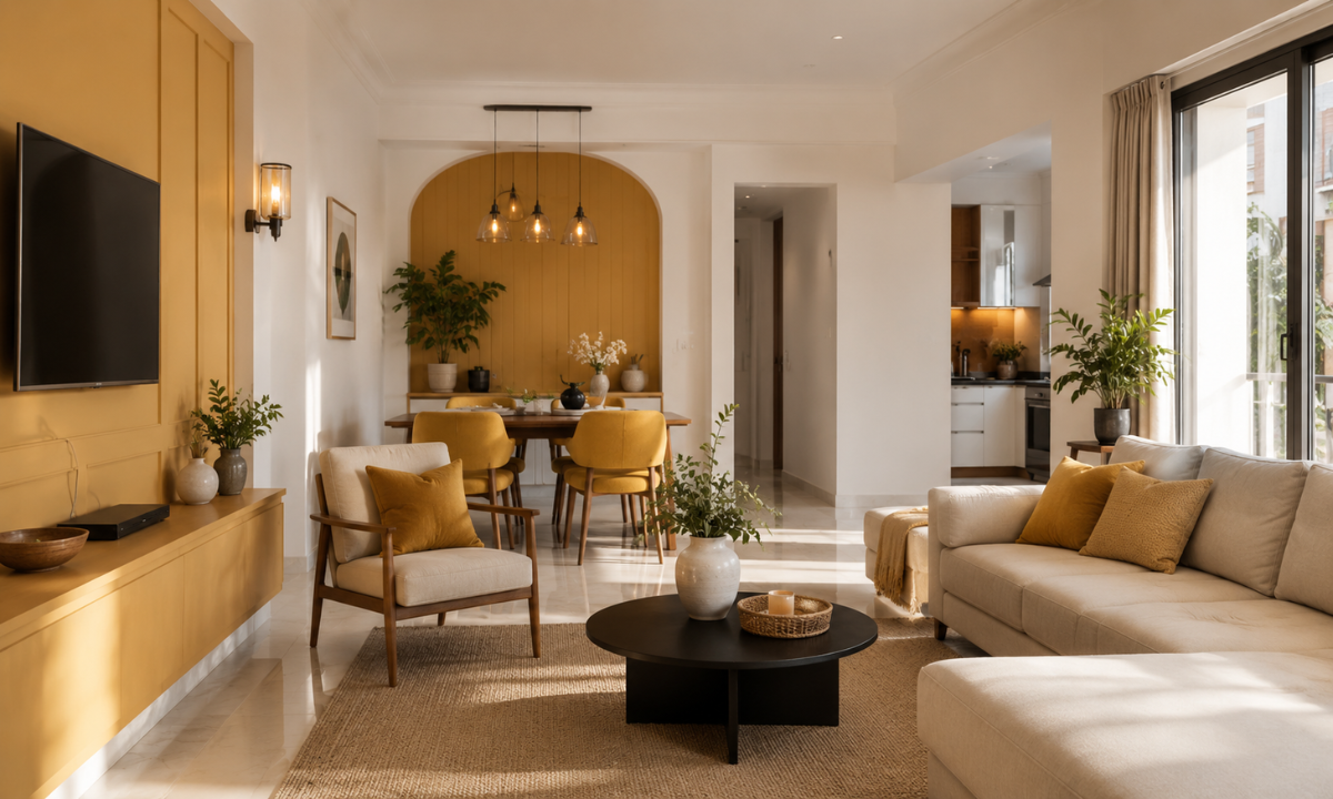
Warm ochre captures the inviting energy of morning sunshine, making it ideal for brightening up dining spaces and dim hallways. Keeping main walls crisp ivory allows ochre accent panels to add warmth without overwhelming the room.
Crisp ivory walls reflect daylight effectively, helping compact urban apartments feel significantly larger and more open. Adding matte black cabinet hardware or slim bronze light fixtures introduces crisp structure to the soft, sunny palette.
Idea 10: Charcoal, Blush & Brushed Brass
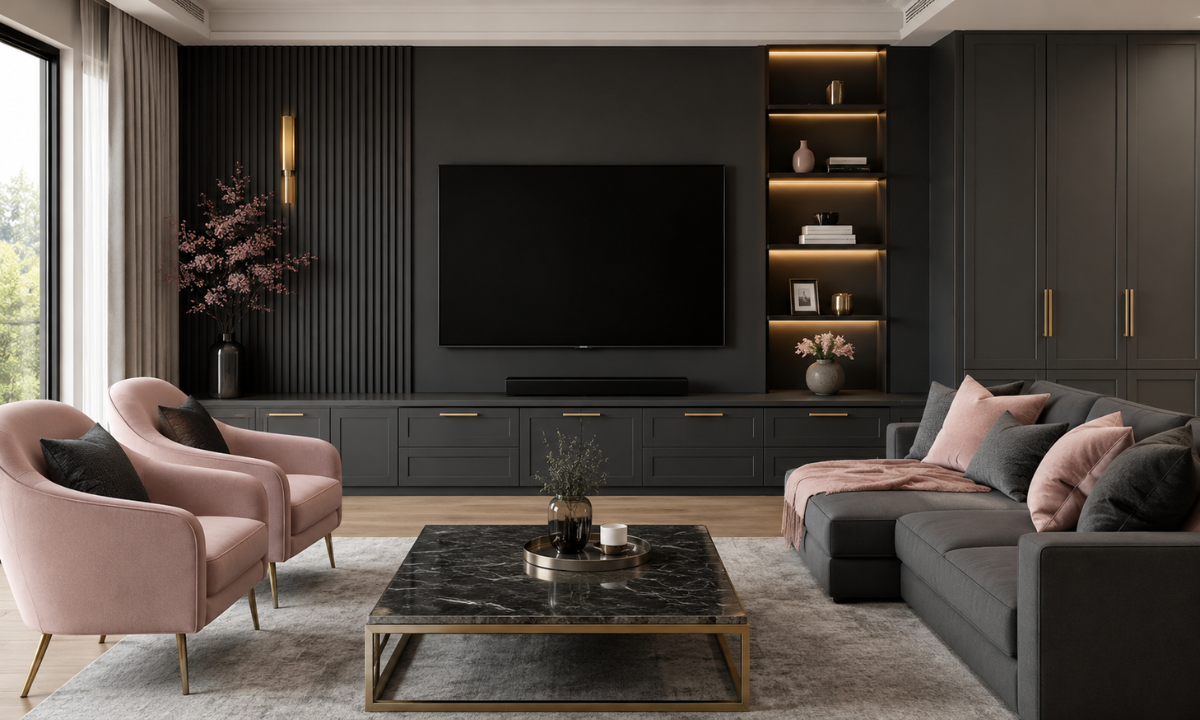
Combining deep charcoal, soft blush, and brushed brass accents creates a tailored, contemporary look. Charcoal grey provides a strong visual anchor, blush pink introduces gentle warmth, and subtle metallic handles elevate the overall finish.
Reserving blush tones for upholstered seating or accent art gives you full flexibility to update soft decor as your taste changes. Meanwhile, dark charcoal feature walls behind TV consoles easily conceal daily scuffs while creating a striking anchor point.
The Color Selection & Lighting Vetting Checklist
Even the most timeless color combinations can look entirely different once applied to your actual walls. Paint swatches under bright showroom lights rarely behave the same way under your home’s natural sunlight or evening lighting. Taking time to test your chosen shades across different times of day protects your budget and ensures your final look matches your vision.
Before purchasing gallons of paint or confirming painter schedules, run your top choices through this practical lighting and color vetting checklist:
- Large-Scale Swatch Sample Testing: Paint 2×2 foot test patches on multiple walls rather than relying on small paper cards. Observe how the shade changes between direct morning sunlight and indirect afternoon shade.
- Artificial Light Temperature Correlation: Check your swatches under your actual home lighting. Warm 2700K LEDs intensify yellow and terracotta undertones, while cooler 4000K daylight bulbs bring out blue and grey notes.
- Sheen and Reflectance Value (LRV) Audit: Review the Light Reflectance Value of your paint. Choose matte sheens for uneven walls to absorb glare, and use satin or low-sheen eggshell in kitchens and hallways for easy cleaning.
- Adjacent Material Harmony: Hold your paint swatches directly against your fixed finishes. Confirm that the undertones complement your cabinet laminate, countertop quartz, timber flooring, and main window drapes.
- Durability and Maintenance Verification: Confirm that high-traffic zones use low-VOC, washable paint formulas that resist scuffs and allow easy spot-cleaning without stripping off wall color.
Testing your swatches over a full 24-hour cycle guarantees complete confidence in your choices. Once your foundation colors are locked in, you can move forward with construction and joinery work knowing your home will feel bright, cohesive, and comfortable.
Why Choose Elevate Interio?
Choosing paint colors for your home should be an exciting journey, not a stressful guessing game. From navigating changing daylight in your rooms to balancing budget expectations, selecting the right palette requires a clear, practical approach. As trusted Interior designers in Bangalore, Elevate Interio has designed our Indiranagar studio experience to take the uncertainty out of color selection, ensuring your walls complement your custom cabinetry, lighting, and overall lifestyle.
Our client-focused process eliminates trial-and-error by integrating color vetting directly into your project’s early planning stages:
- Real-World Lighting Testing: We test large-scale paint swatches inside your actual space under both natural daylight and your planned 2700K to 4000K LED fixtures, making sure your chosen shade looks perfect at all hours.
- Complete Material Coordination: We map wall colors alongside your kitchen laminates, engineered quartz decks, and fabric samples, ensuring every surface works together seamlessly before painting starts.
- Health and Maintenance First: We prioritize low-VOC, non-toxic, and highly washable paint formulations that resist scuffs, making everyday cleanup simple for active homes.
- Upfront Financial Transparency: Every painting scope is fully itemized in your quote, detailing exact paint brands, surface preparation coats, and finish sheens so there are zero surprise costs midway through your project.
Combining functional design expertise with honest project management, we help you build a comfortable, beautiful home that looks great on day one and remains easy to care for over time.
Conclusion
A thoughtful color palette does far more than make a strong initial impression. It sets a comfortable tone for your daily routines, enhances the natural light in your home, and creates a flexible backdrop that adapts as your family’s tastes evolve. By grounding your space in timeless color combinations rather than chasing fleeting trends, you create an inviting sanctuary that brings quiet joy for years to come.
Your home is the setting for your family’s daily story, and it deserves a balanced, practical design tailored to how you actually live.
If you are ready to explore a transparent, stress-free approach to home design, our team is here to guide you every step of the way. Connect with our principal consultants at Elevate Interio today, schedule a visit to our Indiranagar studio, and let us help you curate a bright, functional space you will love coming home to every single day.
For a closer look at how local homeowners experience working with this design studio in Bengaluru, watch this Elevate Interio Project & Service Review to see their execution approach and client feedback firsthand.